This is documentation for Orange 2.7. For the latest documentation, see Orange 3.
Correspondence Analysis (correspondence)
Correspondence analysis is a descriptive/exploratory technique designed to analyze simple two-way and multi-way tables containing some measure of correspondence between the rows and columns. It does this by mapping the rows and columns into two sets of factor scores respectively while preserving the similarity structure of the table’s rows and columns.
It is similar in nature to PCA but is used for analysis of quantitative data.
- class Orange.projection.correspondence.CA(contingency_table, row_labels=[], col_labels=[])
Main class used for computation of correspondence analysis.
- __init__(contingency_table, row_labels=[], col_labels=[])
Initialize the CA instance
Parameters: - contingency_table – A contingency table (can be Orange.statistics.contingency.Table or numpy.ndarray or list-of-lists)
- row_labels (list) – An optional list of row labels
- col_labels (list) – An optional list of column labels
- column_factors()
Return a numpy.matrix of factor scores (coordinates) for columns of the input matrix.
- column_inertia()
Return the contribution of columns to the inertia across principal axes.
- column_principal_axes
A numpy.matrix of principal axes (in columns) of the column points.
- column_profiles()
Return a numpy.matrix of column profiles, i.e. rows of the data_matrix normalized by the column sums.
- data_matrix
The numpy.matrix object that is representation of input contingency table.
- inertia_of_axes()
Return numpy.ndarray whose elements are inertias of principal axes.
- ordered_column_indices(axes=None)
Return indices of rows with most inertia. If axes is given take only inertia in those principal axes into account.
Parameters: axes – Axes to take into account.
- ordered_row_indices(axes=None)
Return indices of rows with most inertia. If axes is given take only inertia in those those principal axes into account.
Parameters: axes – Axes to take into account.
- plot_scree_diagram()
Plot a scree diagram of the inertia.
- row_factors()
Return a numpy.matrix of factor scores (coordinates) for rows of the input matrix.
- row_inertia()
Return the contribution of rows to the inertia across principal axes.
- row_principal_axes
A numpy.matrix of principal axes (in columns) of the row points.
- row_profiles()
Return a numpy.matrix of row profiles, i.e. rows of the data matrix normalized by the row sums.
Example
Data table given below represents smoking habits of different employees in a company (computed from smokers_ct.tab).
Staff group None Light Medium Heavy Row totals Senior managers 4 2 3 2 11 Junior managers 4 3 7 4 18 Senior employees 25 10 12 2 51 Junior employees 18 24 33 12 88 Secretaries 10 6 7 2 25 Column totals 61 45 62 25 193
The 4 column values in each row of the table can be viewed as coordinates in a 4-dimensional space, and the (Euclidean) distances could be computed between the 5 row points in the 4-dimensional space. The distances between the points in the 4-dimensional space summarize all information about the similarities between the rows in the table above. Correspondence analysis module can be used to find a lower-dimensional space, in which the row points are positioned in a manner that retains all, or almost all, of the information about the differences between the rows. All information about the similarities between the rows (types of employees in this case) can be presented in a simple 2-dimensional graph. While this may not appear to be particularly useful for small tables like the one shown above, the presentation and interpretation of very large tables (e.g., differential preference for 10 consumer items among 100 groups of respondents in a consumer survey) could greatly benefit from the simplification that can be achieved via correspondence analysis (e.g., represent the 10 consumer items in a 2-dimensional space). This analysis can be similarly performed on columns of the table.
So lets load the data, compute the contingency and do the analysis (correspondence.py):
from Orange.projection import correspondence
from Orange.statistics import contingency

data = Orange.data.Table("smokers_ct.tab")
staff = data.domain["Staff group"]
smoking = data.domain["Smoking category"]

# Compute the contingency
cont = contingency.VarVar(staff, smoking, data)

c = correspondence.CA(cont, staff.values, smoking.values)

print "Row profiles"
print c.row_profiles()
print
print "Column profiles"
print c.column_profiles()
which produces matrices of relative frequencies (normalized across rows and columns respectively)
Column profiles:
[[ 0.06557377  0.06557377  0.40983607  0.29508197  0.16393443]
 [ 0.04444444  0.06666667  0.22222222  0.53333333  0.13333333]
 [ 0.0483871   0.11290323  0.19354839  0.53225806  0.11290323]
 [ 0.08        0.16        0.16        0.52        0.08      ]]

Row profiles:
[[ 0.36363636  0.18181818  0.27272727  0.18181818]
 [ 0.22222222  0.16666667  0.38888889  0.22222222]
 [ 0.49019608  0.19607843  0.23529412  0.07843137]
 [ 0.20454545  0.27272727  0.375       0.14772727]
 [ 0.4         0.24        0.28        0.08      ]]
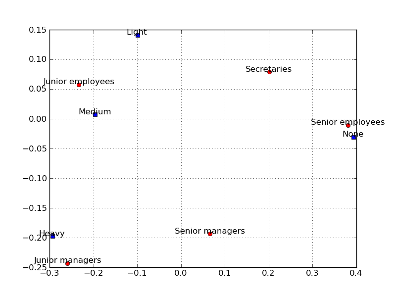
The points in the two-dimensional correspondence analysis display that are close to each other are similar with regard to the pattern of relative frequencies across the columns, i.e. they have similar row profiles. After producing the plot it can be noticed that along the most important first axis in the plot, the Senior employees and Secretaries are relatively close together. This can be also seen by examining row profile, these two groups of employees show very similar patterns of relative frequencies across the categories of smoking intensity.
c.plot_biplot()
Lines 26-29 print out singular values , eigenvalues, percentages of inertia explained. These are important values to decide how many axes are needed to represent the data. The dimensions are “extracted” to maximize the distances between the row or column points, and successive dimensions will “explain” less and less of the overall inertia.
print "Singular values: " + str(diag(c.D))
print "Eigen values: " + str(square(diag(c.D)))
print "Percentage of Inertia:" + str(c.inertia_of_axes() / sum(c.inertia_of_axes()) * 100.0)
print
which outputs:
Singular values:
[  2.73421115e-01   1.00085866e-01   2.03365208e-02   1.20036007e-16]
Eigen values:
[  7.47591059e-02   1.00171805e-02   4.13574080e-04   1.44086430e-32]
Percentage of Inertia:
[  8.78492893e+01   1.16387938e+01   5.11916964e-01   1.78671526e-29]
Lines 31-35 print out principal row coordinates with respect to first two axes. And lines 24-25 show decomposition of inertia.
print "Principal row coordinates:"
print c.row_factors()
print
print "Decomposition Of Inertia:"
print c.column_inertia()
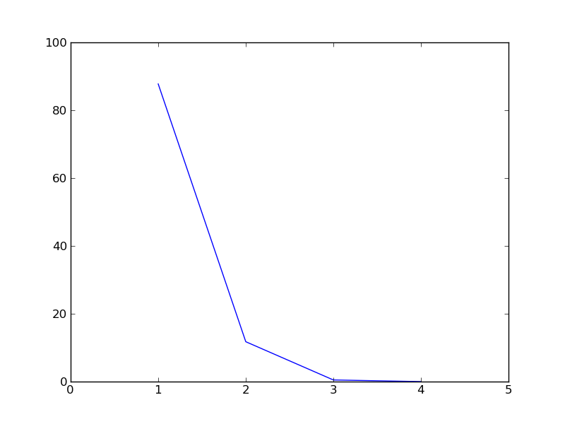
Lets also plot the scree diagram. Scree diagram is a plot of the amount of inertia accounted for by successive dimensions, i.e. it is a plot of the percentage of inertia against the components, plotted in order of magnitude from largest to smallest. This plot is usually used to identify components with the highest contribution of inertia, which are selected, and then look for a change in slope in the diagram, where the remaining factors seem simply to be debris at the bottom of the slope and they are discarded.
c.plot_scree_diagram()
Multi-Correspondence Analysis
Utility Functions
- Orange.projection.correspondence.burt_table(data, attributes)
Construct a Burt table (all values cross-tabulation) from data for attributes.
Return and ordered list of (attribute, value) pairs and a numpy.ndarray with the tabulations.
Parameters: - data (Orange.data.Table) – Data table.
- attributes (list) – List of attributes (must be Discrete).
Example
>>> data = Orange.data.Table("smokers_ct")
>>> items, counts = burt_table(data, [data.domain["Staff group"], data.domain["Smoking category"]])